Product design is all about tradeoffs—and when we designed I Done This 2.0, we had a lot to consider. We added new functionality, like blockers. But we also noticed a few patterns in our user behavior data that we weren’t quite sure what to do with.
We find, for example, that a higher volume of short entries helps people feel great about their work, and it’s more interesting for their co-workers to read. Does that mean we should encourage this behavior, and cap entries after a certain number of characters?
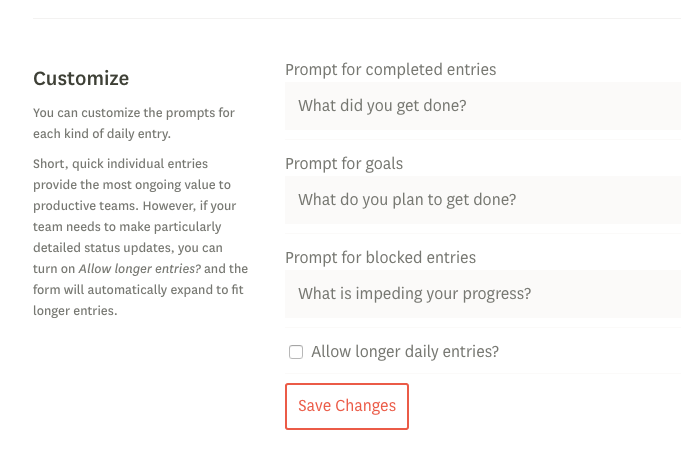
Ultimately, we set our default in I Done This 2.0 to shorter entries, but we added an optional button to allow longer entries. We don’t want to fall down the rabbit-hole of offering too many configuration options—but we also don’t want to lose customers who find our product useful. When it comes to exact entry length, we’re passing the baton to those who know their team’s needs best—team leaders.


