If you’re a product person, you’ve probably spent a lot of time obsessing over the minute details of your app. You’ve spent hours tweaking the wireframes in Sketch, and even more hours working with engineering to make sure that everything’s absolutely perfect.
But even once you’re satisfied, none of that hard work actually matters unless you can get people to use your product.
Your users won’t always care about gutter sizing or great typography, especially when they’ve just signed up for a new product. They just want something that they can use and that can work.
The good news is that you’ve already sold them on your product’s value proposition. They’ve downloaded or installed your app and, in doing so, given you a clear signal that they’re interested in what it has to offer.
All you have to do is roll out the welcome mat and show them how it works. But demonstrating the value of your app and the way it works is the key to engaging users who will actually stick around.
A simple checklist is often one of the best tools for that. As productivity guru Atul Gawande writes in The Checklist Manifesto, “Under conditions of complexity, not only are checklists a help, they are required for success.”
Checklists break a complicated system into small steps that are easy to accomplish. They hook into psychological principles, creating motivation for new users to actually complete onboarding tasks. From scheduling a social media post to creating a channel in a chat app, breaking these desired actions into small, simple steps is the key to actually getting people to do them.
In this article, we’ll look at five different examples of how products use checklists to drive success in user onboarding.
The “Nagging” Checklist
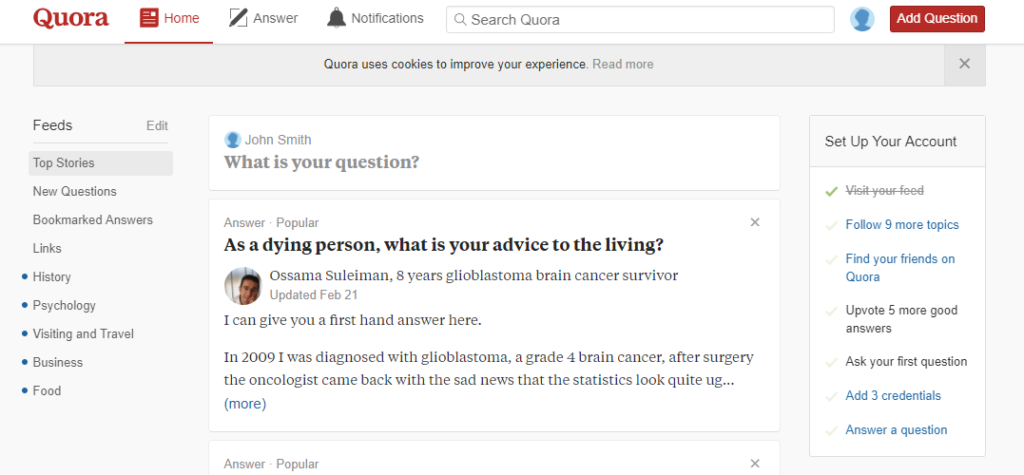
A lot of products take user input before they can actually prove value. Take Quora, a social network for sharing knowledge in the form of asking and answering questions.
Quora’s onboarding consists of several steps intended to drive user participation: “Follow 9 more topics” or “Answer a question.”
Left on their own, these actions aren’t particularly compelling. If Quora just presented this straightforwardly, most users would probably ignore onboarding altogether. But without following users or adding friends, Quora’s experience isn’t likely to convince new users to stick around.
Quora solves that problem with a simple, effective checklist that appears on the right side of the product during onboarding. Instead of presenting users with a ton of different minute tasks to achieve, they restrict the checklist to seven simple items, from “Visit your feed” to “Answer a question.”
The moment a user goes to the home page, the first task automatically completes, creating a sense of progress that makes it more likely that a user will hit other items on the list.
The Dog-Food Checklist
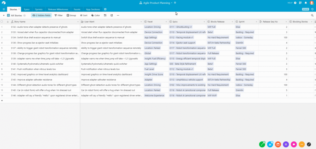
If you’re building a product or an app (like I Done This) that’s meant to help people be more productive and get stuff done, eat the dog food by using your own product for user onboarding. Airtable is a great example of how it’s done.
Airtable is a powerful tool that is a hybrid between a spreadsheet and a database. If that sounds complicated don’t worry—all you need to know is that Airtable is a flexible tool that can be used for any number of use cases, from collaborating around UX research to curating your favorite teas.
Building such a wide, flexible product, however, presents its own difficulties for user onboarding because it’s hard to create a one-size-fits-all process. Even if you show off the most common use cases, you risk leaving out users who want to use your product in a completely different way.
Airtable elegantly sidesteps this in its onboarding flow with a simple six-step checklist. Each item on the list launches a visual tutorial that teaches users how to use a specific feature or complete an action.
New users can hit every item on the checklist, or they’re free to dive straight into the product and explore on their own.
The Incremental Wins Checklist
Aiming at small, incremental wins has been scientifically proven to be more effective than trying to attack massive goals. That’s because small wins include a powerful motivational effect. Knocking a win out of the park—no matter how small—releases a small surge of dopamine in your brain that pushes you to the next task.
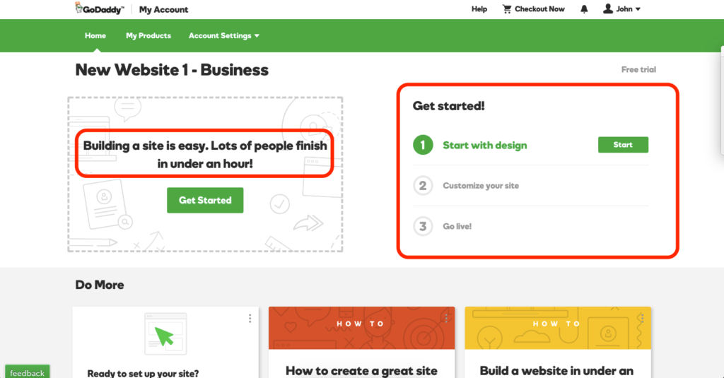
This is a principle that GoDaddy leverages to perfection with their user onboarding. GoDaddy’s website builder is a complicated tool that’s rich with features. It gives users everything they need to design and launch a website.
But because the website can do so many different things, it’s hard for users to know where to start. GoDaddy solves this with—you guessed it—a checklist.
To help ensure a decent level of commitment from its users, GoDaddy presents a simple onboarding checklist that provides a clear indication of the time required—“Lots of people finish in under an hour!” That way, only users who can complete the checklist move on to the next step.
From choosing a design to customizing the site, GoDaddy breaks down the large task of building a website into smaller, manageable chunks . As users complete each task, they’re filled with a sense of progress that motivates them on to the next.
The Quick Win Checklist
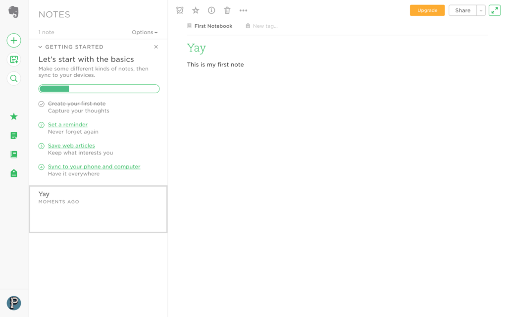
Evernote’s onboarding checklist begins with a super simple task: Create a new note. What’s great about this is that it also brings users directly to the core functionality of the product. Evernote’s product is a note-taking app that makes it easy to create and access your notes across devices. By driving users straight to creating a note during onboarding, the product unlocks the feel-good factor that comes from a job well executed.
But quick wins are about more than that initial surge of dopamine. They also build upon the psychological principles of commitment and consistency. As humans, once we’ve committed to a course of action, we’re more motivated to see it through to the end. By helping new users knock it out of the park from the first step, Evernote’s checklist incentivizes users to progress through each successive task.
This works particularly well for Evernote’s product because creating a note takes us to a valuable aha moment where we experience the core value of the product firsthand. Simply create a note and it automatically syncs up to the cloud across all of our devices.
The Incentive Checklist
While there are many different incentives you can leverage during user onboarding—from promising users they’ll be more productive or save more money—nothing beats cold, hard cash.
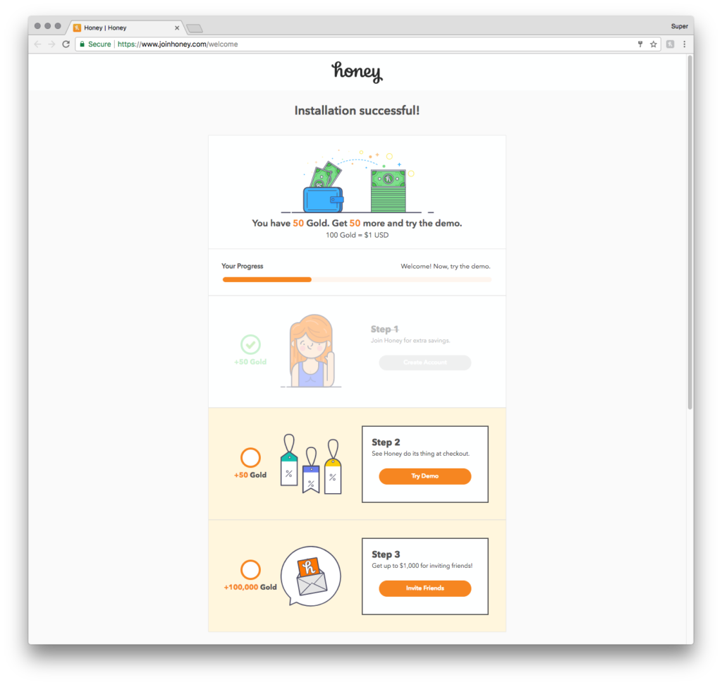
Coupon app Honey offers new users just that to entice them through the onboarding process. For completing the onboarding process, new users get 50 Honey Gold—an in-app currency that’s redeemable for cash or gift cards.
Honey’s onboarding checklist serves two important functions. First, new users learn the ins and outs of the product and how to use it. Second, by learning about the product, users actually earn rewards. The more they use the app, the more rewards they can accumulate in the future.
Checklists for All
The checklist is a time-honored tool for productivity. It breaks big, daunting projects into small steps that can be easily accomplished. That’s why it’s also the perfect tool for user onboarding.
By giving users a clear set of steps that they can use to learn about your product, you’re guiding them to the value of your app and increasing the likelihood that they’ll stick around. As a bonus, you’re tapping into psychological principles that help you build early engagement in new users.
This is a guest post from Ty Magnin, director of marketing over at Appcues. Appcues is a tool that helps product people drive greater adoption, satisifaction, and retention. For more, check out the Appcues blog.
P.S. If you liked this article, you should subscribe to our newsletter. We’ll email you a daily blog post with actionable and unconventional advice on how to work better.

